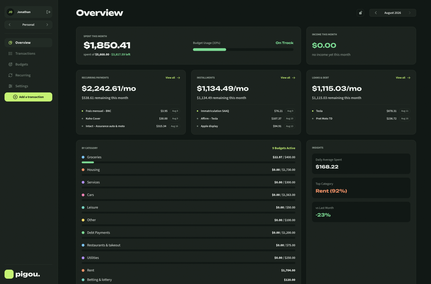
Pigou is a personal budget and a freelance ledger in the same app. Groceries and invoices, side by side, without either one contaminating the other. I designed and built it across three surfaces: an iPhone app, a browser web app, and the marketing site.
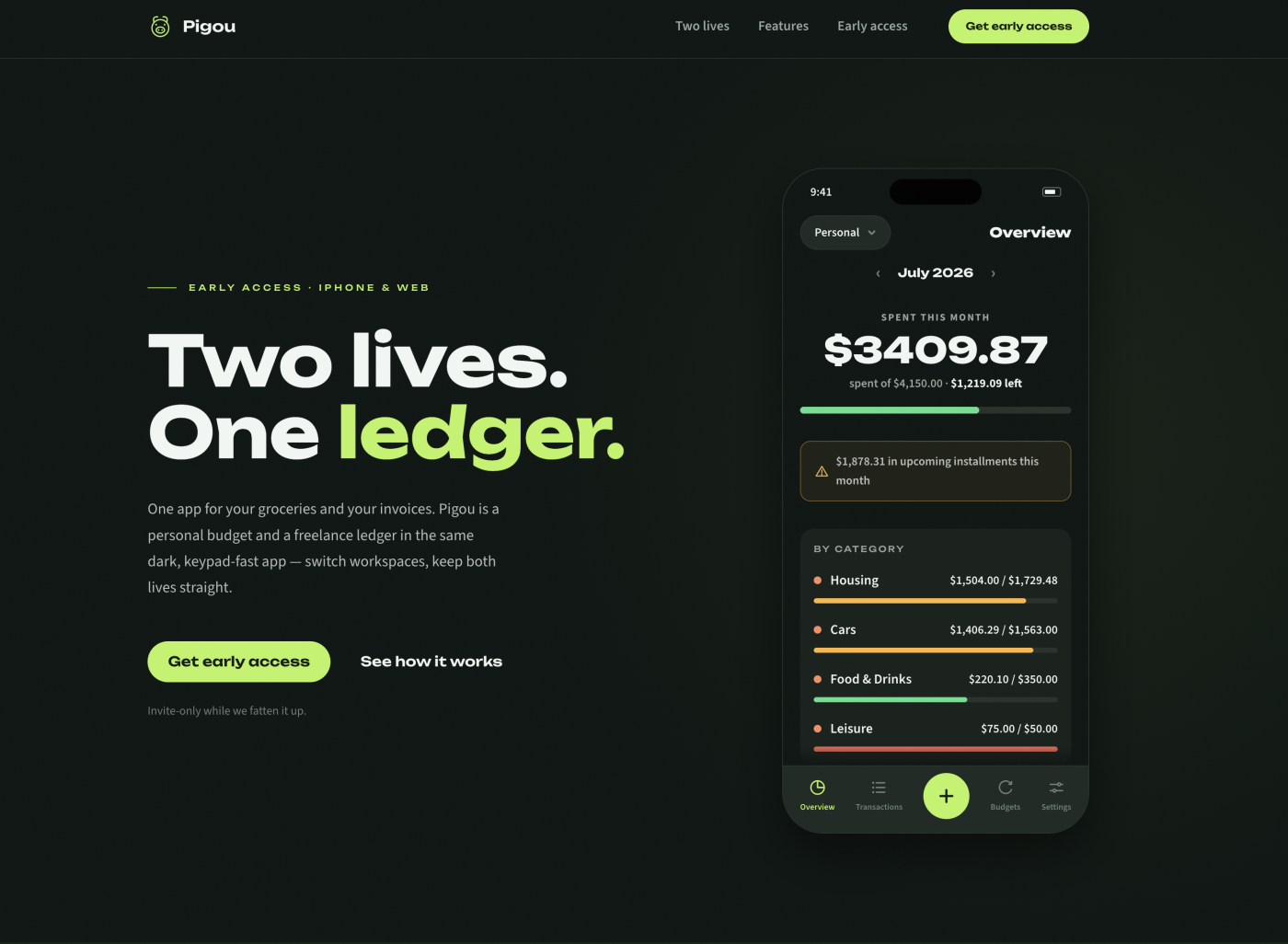
Context
Anyone who freelances runs two financial lives at once. There is the personal one, where the question is whether there is enough left this month for groceries, and the business one, where every expense carries a tax breakdown, an invoice number and a receipt that has to survive until tax season. The tools available force a choice: personal budget apps that collapse the moment you need sales tax, or accounting software that is miserable for tracking whether you overspent on takeout. Most people end up running both, plus a spreadsheet to reconcile them.
Challenge
- Two contexts in one interface, with no crossover. Personal and business money must never blend, but switching between them has to be effortless.
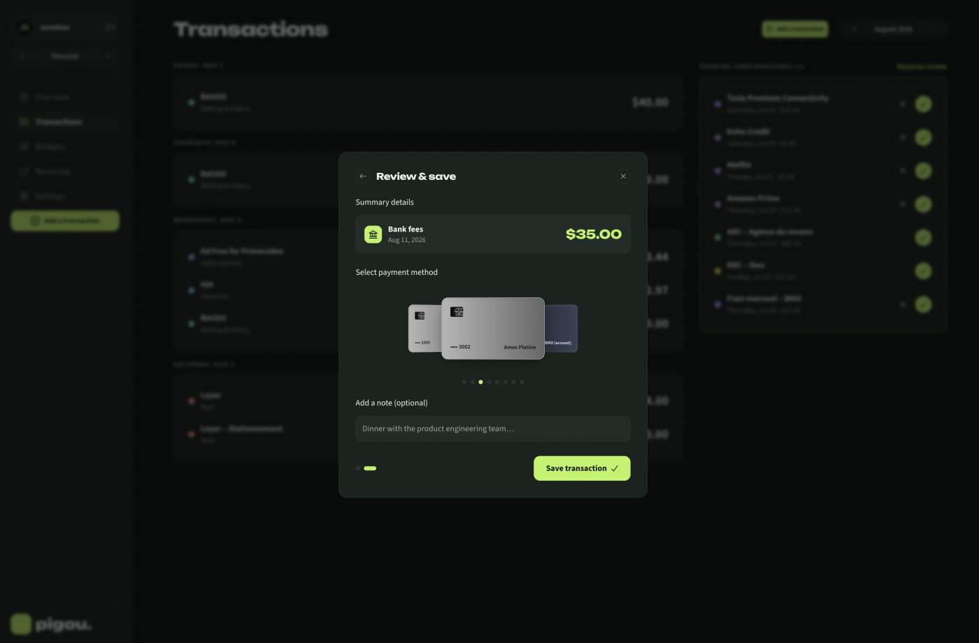
- Logging has to be faster than not logging. A budget app only works if entering a transaction takes seconds, otherwise the habit dies in week two.
- Freelance entries need real depth, taxes and invoice numbers and receipts, without making a personal grocery entry feel like filing paperwork.
- Three surfaces to keep coherent, designed and built by one person.
Approach
- Workspaces as the core model – Made the switch between personal and business a single tap rather than a separate app or a filter. Each workspace keeps its own categories and history, so the two lives stay genuinely separate while living in one product.
- Speed-first entry – Designed the logging flow around a keypad and three taps, treating entry time as the primary design constraint rather than an afterthought.
- Depth only where it is needed – Business entries carry their tax breakdown, invoice reference and receipt; personal entries stay light. Same component, different weight, decided by workspace.
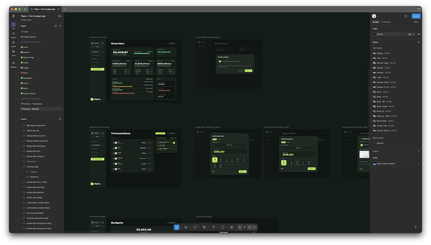
- Tokens as the contract – Defined colour, type and spacing once and mirrored them across the React Native theme, the Tailwind config and the website SCSS, so three codebases in two languages stay visually identical without sharing a component.
- Three surfaces, one language, separate programs – Deliberately did not ship the mobile app to the browser through React Native Web. It produced markup I would not want to own, and the web deserves to be built as the web. The surfaces share a visual language, not a codebase.
- Mock before build – Every design change gets mocked and reviewed as a self-contained prototype before a line of production code is written, which keeps the visual decisions out of the implementation phase.
Visuals

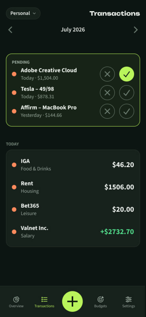
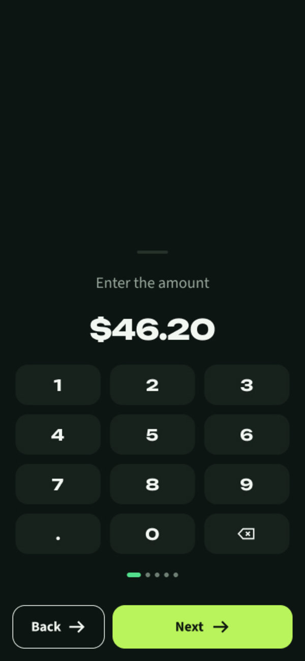
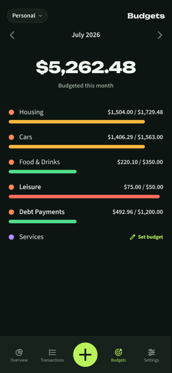

Where it stands
iPhone app, browser web app and marketing site
shared tokens across React Native, Tailwind and SCSS
invite only, with the iPhone app in TestFlight
- A working product in daily use, with the core loop of logging, budgets and workspaces in place.
- A design system that holds across two completely different technology stacks.
- A public marketing site and a browser web app, both live, both hand built.
What made this different
The interesting problem here was never budgeting. It was context. A freelancer's two financial lives have different rules, different vocabulary and different stakes, and most tools solve that by making you leave one to enter the other. Designing the switch as a first-class idea, rather than a settings toggle, shaped everything else: the navigation, the data model, even how a single transaction row renders. It is also the project where I had to decide, and then live with, the hardest engineering trade-off in my work so far: keeping three surfaces visually identical without letting them share a line of code.